A Design Problem
I found the following graph on www.wiscosurvey.com, the website of a company that specializes in software used in the collection and analysis of surveys.
[Scroll down to see our solution to this graph's design problems.]
My Analysis
Though the graph has many labels—a title that says “Wage Survey for Child Care Center Teaching Staff,” a vertical axis title that says “Non-Profit Status,” and a horizontal axis title that says “Exit Interview”—it is still difficult to determine what the graph is trying to say. After some study, I believe the graph intends to display a count of child care teaching staff who took a wage survey, including a breakdown of the industries they are employed in and the profit/non-profit status (displayed as “Yes” and “No”) of their employers. Besides being unclear, this graph has several other problems as well, which include:
- It is grouped by “Yes” and “No” answers while the different industries are encoded using color. This is a bad choice because, while the grouping encourages comparisons of either “Yes” or “No” answers among different industries, the grouping makes it difficult to compare the “Yes” responses to the “No” responses in any one industry. Additionally, because the industries are encoded with color, we end up with nine different colors, which forces us to spend our time looking back and forth between the legend and the bars, instead of actually focusing on the data.
- The 3-D perspective of the bars and grid only serve to detract.
- The drop-shadow, dark borders, and white background color on the legend gives visual salience to content that ought not to be prominent, for it plays only a supporting role.
- The colors are much too bright, which discourages the reader from examining them closely. Bright colors should be reserved for items that need to be highlighted.
- The horizontal grid lines are slightly too dark and the dotted pattern is more distracting that a solid light gray line would be. Additionally, the vertical dotted line (seen above the yellow bar) serves no useful purpose at all.
- The background color of the plot area is too dark. Unless there is a good reason for using a different color, the background should be white or slightly off-white to provide the maximum contrast needed to feature the bars.
- Vertically-oriented text, such as the Y-axis title “Non-Profit Status” is more difficult to read than horizontally-oriented text.
- There is no obvious reasoning behind the order of the various industries.
Several Solutions
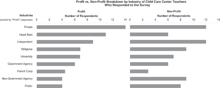
I have created three improved solutions. I did this to demonstrate that, for any given problem, there is often more than one good solution; the choice between different solutions depends on what you want to readers to focus on and how they will use the information. Here’s the first solution:

This redesign makes use of a very lean version of Edward Tufte’s "small multiples" in which separate graphs, each differing along a single variable, are laid out next to each other (either vertically, horizontally, or in a matrix) to enable easy comparisons between values. One can easily compare the "Profit" or "Non-Profit" responses between industries by reading down a single graph. Comparisons between the "Profit" and "Non-Profit" responses within a particular industry can be made by reading across the two graphs. Because this display separates the Profit and the Non-Profit entries (similarly to the original), this solution would likely be used if comparisons between the industries are more important than comparisons within the industries.
The second solution is a more conventional grouped bar chart:

This design groups the “Profit” and “Non-Profit” portions of each industry together making for easy comparisons. Because the two sectors differ in color intensity, one can easily focus on just the gray or just the white bars to look for patterns between different industries as well. Notice that the plot area of this graph has been filled with a light gray. This was done so that, when people look at the graph, they perceive both sets of bars as having a fill color (dark gray and white), as opposed to seeing one set as bars with a dark gray fill and the other set as bars without a fill color, which would imply that the latter were less important.
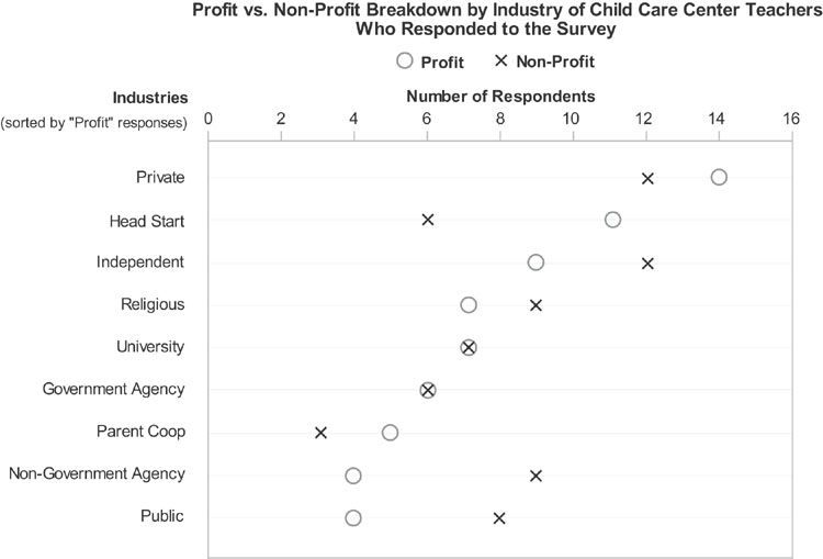
The third solution is a dot plot:

This design uses “X” versus “O” shapes to distinguish the two sets of data. This makes overlapping data points readily apparent by creating the shape of a circle with an X in it whenever the two data sets have the same value (for example, see the data for “University” and “Government Agency”). If such overlaps are important, this design could be especially useful for highlighting these values.
In all three solutions, the graphs have been sorted to show the industry with the most "Profit" answers first. This ordering makes it slightly easier to read the graph by placing “Profit” values that are closest in size near one another. Sorting the values in this way also allows us to investigate whether there appears to be a correlation, such as an inverse relationship, between Profit and Non-Profit businesses in an industry (although if determining correlation were our primary goal, there is no better graph than a scatterplot).
As these proposed solutions demonstrate, good design principles don’t inhibit creativity, they allow us to focus our creativity on what matters—accurately and informatively presenting the data. Although each of these solutions has its relative strengths and weaknesses, all three employ good design principles, and consequently, all three communicate far better than the original.
