A Design Problem
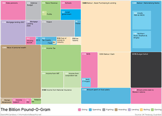
The following chart, entitled "The Billion Pound-O-Gram" was created by David McCandless for the Guardian to help readers understand the size of the British budget deficit (the black rectangle) by comparing it to other large sums of money that are familiar.
[Scroll down to see our solution to this graph's design problems.]
[Click graph to enlarge.]
By using rectangles of varying sizes arranged as a treemap of sorts, McCandless forces us to perform a perceptual task that we can't do well (that is, area comparisons). This is a bad choice when he could have used a bar graph instead and allowed us to compare the lengths of bars that share a common baseline, which we can do quite well. Furthermore, his arrangement of the rectangles is arbitrary—not based on category or on the sizes of values—which compounds the difficulty.
To better understand this point, try to answer the following questions without reading the numbers that appear in the rectangles:
- Which represents a larger amount: Mortgage Lending 2007 or NHS?
- How much greater is Mortgage Lending 2007 than State Pensions?
- Does State Pensions compared to Tesco Revenue look like the difference between 62 and 59, or much greater?
- Which is bigger: Income Support or Police?
You might argue that these comparisons aren't critical to the story, which is primarily about the budget deficit. If we concern ourselves only with comparing the deficit to other values, nothing about the chart's design makes this easy, even when items are adjacent to one another. For instance, try answering the following questions:
- How much greater is the deficit than Africa's entire debt to Western nations, which appears immediately below it? (And don't cheat by reading the numbers.)
- How much greater is "Bailout: Asset Purchasing and Lending" than the deficit?
- How does Income Tax compare to the deficit?
Without reading the numbers, you're forced to make wild guesses, which are considerably different from the truth.
A Solution
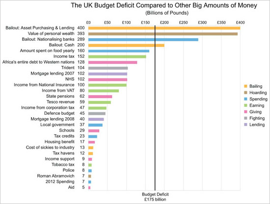
All of these comparisons are incredibly simple to make using the bar graph below. Take a minute to notice how easily you can see the relationships between these values from largest to smallest and compare them. Notice especially how easily you can compare every value to the budget deficit, which appears as the vertical black line.

[Click graph to enlarge.]
In the bar graph, I stuck with the colors that McCandless chose to make it easy to compare his chart to mine, except that I tweaked a few colors a bit to resolve minor problems. For example, in McCandless' chart some colors stand out more than others, but they should be equal in salience unless there's a reason to feature some items over others. Also, for some unknown reason McCandless sometimes altered a single color from rectangle to rectangle, which serves no purposes and creates potential confusion. Notice that some of the green rectangles are lighter than others, yet they all represent "Earning."
When we set out to tell a story with a graph, we should design that graph to communicate the story as clearly and effectively as possible. Choosing a graph type that asks people to make comparisons using areas such as McCandless' graph above (or a pie chart) is not the way to do this when better choices are at hand.
