A Design Problem
The following set of pie charts was introduced in my Discussion Forum by a contributor.
[Scroll down to see our solution to this graph's design problems.]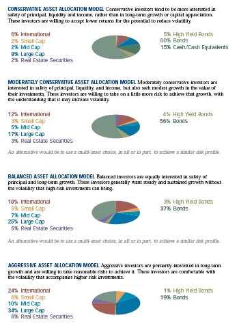
Each pie chart presents the breakdown of one out of four different asset allocations. Because the only difference between the individual charts is the asset allocation, once we learn to read the first one, we know how to read all of them.
While a series of charts was a good choice for this display, it suffers from several problems, many that stem from the use of pie charts, which rely on our ability to compare the relative sizes of 2-D areas—something we do poorly. When the contributor posted this graph, he suggested that other participants in the Discussion Forum mock up alternative designs that would communicate this information more effectively. He also posted his own example, which is pictured below:

The primary strength of this redesign lies in the fact that creator chose to use bar charts, which rely on our ability to compare bar lengths (something we do quite well), instead of pie charts. By switching to bars and adding a risk/return scale on the right, he also clarified how the various investment types rank in terms of risk/return.
My Solution
I felt that, while dramatically improved, the redesign still had a few problems. My redesign is below.

[Click graphs to enlarge. If text is difficult to read, your web browser might have image scaling enabled. Left-click to zoom.]
The first thing that you probably noticed was the change in orientation. While the two previous examples stacked their graphs vertically, I switched to a horizontal layout. When horizontal bar graphs are laid out vertically, it makes magnitude comparisons between two bars in different graphs slightly easier, but if you want to compare the same items in multiple graphs, it's harder to isolate them in each graph. When they are arranged horizontally, however, it's much easier to scan across a row to see how a particular item compares from one graph to another. For instance, by scanning across the Mid Cap bars in my version of the display, you can quickly see how they compare; in the vertical layout you must work harder to find the correct bar in each graph to make these comparisons, even when the bars are united by a common color, as in the first redesign. Because I assume that the main purpose of this design is to determine how the different asset allocations differ, the extra efficiency provided by a horizontal layout more than outweighs any slight reduction in the accuracy of comparisons within a single graph.
Next, notice the bar labels. The first redesign put the labels on the right side of the graphs, separated from their bars by quite a distance. I moved them to the left side, right next to the bars. This makes it easier to associate the labels with their bars and also allowed me to eliminate the legends.
Finally, I abandoned red and green color-coding used in the first redesign. I did this for a few reasons. First, the use of red and green together means that the color-coding will be lost on the 10% of men and 1% of women who are colorblind. Second, I assume that the color choice was made based on the implied meanings of red and green in Western cultures, where red can signify "bad" and green "good." It is certainly true that higher risk is "bad" compared to lower risk. But red and green can also have another applicable meaning: Green for gains and red for losses. In this case the investments with the higher returns should be green and the lowest returns should be red. Unfortunately, because risk and return go hand-in-hand, by using red and green to encode them, you're bound to encode one of them in a counter-intuitive and misleading manner.
If I had simply changed the colors from red and green to another combination, such as blue and orange, it would have solved the problems mentioned above. However, there is another problem associated with the bars, which use gradually stronger color intensities to indicate risk/return extremes (both high and low). Because the colors of the "International," "Large Cap," "Bonds," and "Cash" bars are more intense than the other bars, they appear to be more important. "Mid Cap," fades into the background, hardly visible next to the "Large Cap" bar. This can be a useful effect when certain bars are more important than others, but in this case, each bar is equally important. As such, I used a single, muted hue.
Perhaps there are additional improvements that could be made to my redesign. If so, please feel free to continue the discussion. By maintaining open dialogue, we can continue to discuss the pros and cons of various design decisions and everyone can benefit.