A Design Problem
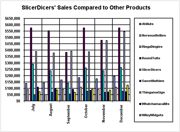
This example was created to illustrate some characteristics of poor design for the book Show Me the Numbers.
[Scroll down to see our solution to this graph's design problems.]
My Analysis
This graph is supposed to compare sales of the product SlicersDicers to each of the other products, but, as you can see, its design does not match its purpose. Readers would have to work very long and hard to glean this information.
A Solution
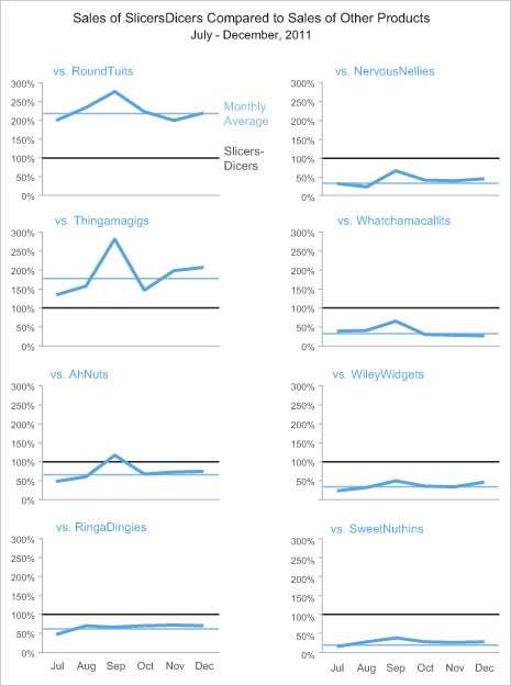
My solution below, however, is nicely designed to convey this information in an obvious and clear manner.

Anyone looking at this series of related graphs would understand its intention immediately and would be able to discern the entire message in a matter of seconds.
